Technical Analysis 101: The MACD Indicator

If you’ve looked into using Technical Analysis, then you’ve probably heard of the MACD (Moving Average Convergence Divergence) indicator. So what is it? How does it work? And can it be used to help us make smarter trading and investing decisions?
Before we go on: a quick explanation of Technical Analysis (or “TA”)
TA or “chart wizardry” is the study of past price and volume patterns in charts to try and predict what’s going to happen next. It’s never a sure thing (even for the most skilled wizards among us) but it’s a whole lot better than guessing.
You can use TA when trading stocks, cryptocurrency, forex, commodities and so on.
The easiest way to describe TA is through a simple example: the trendline.
The chart below shows the longer-term upward trendline for the price of Facebook in dollars:
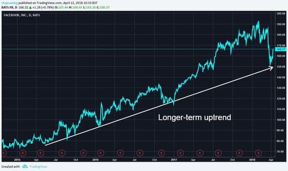
The top right corner of the chart shows Facebook‘s recent price plummet following the Cambridge Analytica data scandle. This involved the UK-based data firm (Cambridge) using the data of up to 87 million Facebookers to sway political results.
Obviously, this made people upset, and the share price tanked nearly 20% in ten days as a result.
But even with all this commotion, Facebook’s share price still bounced off the longer-term trendline shown. This could be interpreted as a bullish indicator (buy signal) from a TA perspective.
However, if the share price were to suddenly drop much further below the trendline, the Facebook bears could come out of hibernation — meaning we could see the trend line get clawed down like Leonardo DiCaprio in The Revenant.
Trendlines are just one type of TA indicator and there are endless more. I cover some of them in chapter 19 of this book.
What is the MACD?
A psychoanalyst and professional money manager named Gerald Appel invented the MACD in 1979.
The MACD is a TA indicator used by traders to spot price trends and trend reversals. It is a way for traders to gauge the price momentum of an investment based on the overall sentiment of the crowd.
It does this by measuring the relationship between short- and long-term trends (we will cover all this shortly!).
How does the MACD work?
The words “moving average convergence divergence” sound complicated when put together, but are easier to explain if we split them up into:
- Moving average, and
- Convergence Divergence.
1. Moving Average
To get to grips with the MACD, we first need a good understanding of Moving Averages (MA).
The MA is a type of trendline that involves slightly more calculation than the “connecting the dots” trendline shown in the earlier Facebook example.
Essentially, the MA is an average price that moves each day. I’ve included a simple example of how this works in the box below.
Simple example: moving average
If the price of a stock is £5 on Monday and £6 on Tuesday, then the 2-day average price would be £5.50 on Tuesday — or the average of each price over the last two days.
If on Wednesday the stock price is £6.50, the 2-day average would be the average of £6 (Tuesday) and £6.50 (Wednesday), which comes to £6.25.
To show the moving 2-day average, we can draw a line between:
- The 2-day average price on Tuesday (£5.50), and
- The 2-day average price on Wednesday (£6.50)
The chart below shows what this looks like:
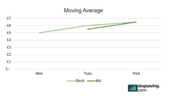
As you can see above, the 2-day MA doesn’t tell us much about a trend. But if we extrapolate the MA to, say, 200 days, the trend becomes much clearer.
Let’s now go back to Facebook and see what its 200-day MA looks like right now…
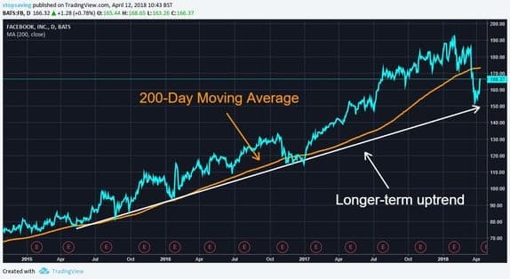
‘Technically’ speaking, the 200-day MA shows a clear uptrend. But when the Facebook stock price (blue line) dropped below the 200-day MA (orange line) in the top right corner of the chart, the trend broke down temporarily, and the bears started waking up. Sorry Leo.
What’s interesting here in terms of the MACD is this: the 200-day MA rose significantly before the stock price started tanking. Put another way, the MA line ‘diverged’ up and away from its normal and steady upward trend.
Why is this relevant?
When the trend is going up too fast, it can get tired and run out of steam. Markets are made of bulls (buyers) and bears (sellers). There are only so many bulls to fight the bears. When prices get too high, buyers start realizing that they are flying too close to the sun, so they start selling.
A domino selling effect can then ensue, which causes the price to drop.
Moving average day counts
The 200-day MA is a long-term indicator, but MA’s come in many day counts: 100-day, 50-day, 30-day, 26-day, 20-day, 12-day and so on.
The higher the day count, the stronger the trend.
Two moving averages on the same chart?
Traders often plot two MAs on the same chart to look for early signs of trend changes. Two examples of this you may have heard of are the:
- Golden cross: when a short-term MA rises above a longer-term MA. This is a buy signal.
- Death cross: when a short-term MA drops below a longer-term MA. This is a sell signal.
The below chart for bitcoin (blue line) shows the 50-day MA (white line) crossing the 100-day MA (orange line) and each trend that is formed:
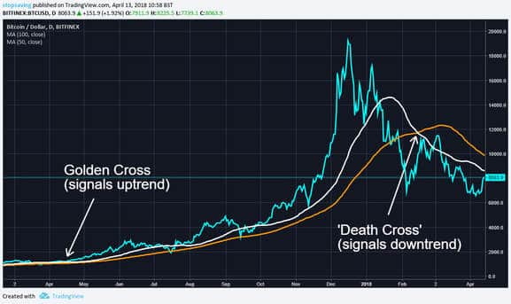
Notice above how the MA’s get closer and further away from each other at different times. This idea is the basis behind how the MACD is used to gauge price momentum. We’ll cover this more shortly!
Exponential Moving Average (EMA)
So far, we have discussed the ‘simple’ moving average or SMA. The MACD uses something called an Exponential Moving Average (EMA).
The EMA is similar to the SMA, except more recent prices carry more weight. This means that the EMA reacts faster to recent price changes than the SMA.
Simple example: Exponential Moving Average
Going back to our earlier example, Wednesday’s £6.50 stock price would carry more weight (count more) than Tuesday’s £6 price in calculating the EMA.
In other words, the EMA ‘average’ price between Tuesday’s £6 price and Wednesday’s £6.50 would be closer to £6.50 (more recent) than £6 (less recent).
This means the EMA price might be £6.30, for example, as opposed to the simple mathematical average of £6.25.
2. Convergence divergence
The second element of the MACD is “convergence divergence” as it relates to the moving averages — or, more precisely, two different exponential moving averages on a price chart:
- 12-Day EMA (shorter-term)
- 26-Day EMA (longer-term)
With the MACD, how these two EMAs interact with each other can help traders decide whether a trend is sustainable, or is expected to reverse. We’ll get to that in a moment, but first, let’s look at a quick example to show how the MACD line is plotted on a graph.
Example: how to calculate the MACD line
The MACD line is calculated by subtracting the 26-day EMA from the 12-day EMA at different points in time and then plotting those points on a graph. The table below shows the MACD entries for a stock from Monday through Friday:
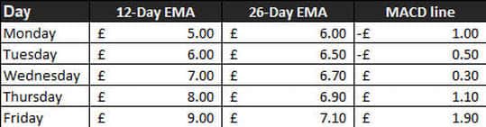
We can then plot the MACD line on a chart. The MACD line is in grey:

Let’s now get back to convergence and divergence…
- Convergence: the two EMAs get closer to each other.
- Divergence: the two EMAs get further apart.
Notice in the above chart that the MACD line is zero when the two EMAs cross each other. This is a bit like the “golden cross” and “death cross” we mentioned earlier. In other words, when the MACD line is close to zero, it could be a sign of an upcoming trend reversal.
The golden cross and death cross seem to be good indicators of a potential trend change, but they only happen every so often. The MACD line, however, is constantly flowing and changing.
When the MACD line is greater than zero, the shorter EMA (12-day) is higher than the longer EMA (26-day). As the MACD line gets higher, the upward trend gains momentum. At some point, however, the MACD line gets too high, meaning the upward price trend could start to run out of steam.
Why? Because as we mentioned earlier there are only so many buyers, and sooner or later the bears return.
The opposite happens when the MACD line becomes too negative. Eventually, the sellers run out of steam and the downward trend loses momentum.
We’ll put this all together in an example soon enough, but first, we need to collect one more piece of the MACD puzzle…
MACD histogram
The MACD indicator has one more line which we have not yet discussed: the signal line.
The signal line is the 9-day EMA of the MACD line.
The signal line ‘trails’ the MACD line, a bit like how longer-term EMAs trail shorter-term EMAs. When the MACD line crosses the signal line, we have:
- Bullish crossovers: when the MACD line crosses the signal line from below. This is a bit like a “golden cross” and is interpreted as a buy signal.
- Bearish crossovers: when the MACD line crosses the signal line from above. This is a bit like a “death cross” and is interpreted as a sell signal.
The distances between the MACD line and the signal line change all the time and can be positive or negative.
These distances are plotted on a histogram: a type of bar chart (I’ll show one in the next section).
The histogram crossover signals occur when the distance between MACD line and the signal line is zero.
Bringing it all together: the MACD in action
Having read this far, you can see there are plenty of nuts and bolts which make up the MACD. Let’s now apply what we’ve learnt to the price of bitcoin during the recent crypto correction using the below chart…
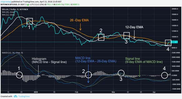
When bitcoin’s price had skyrocketed to almost $20,000 in December 2017, the 12-day EMA was soaring high above the 26-day EMA. Then as the price started dropping, the blue MACD line began curling down towards the green signal line, waking up the bears.
This was also reflected by the light grey histogram bars dropping towards zero.
Note that the histogram shows the exact same information as the blue and green lines converging and diverging, just in a different way.
The blue MACD line then crossed below the green signal line, meaning the light grey histogram also went from positive to negative (circle 1). Much like the death cross we discussed earlier, this would have been a sell signal for traders using the MACD.
What’s interesting here is that the MACD would have shown a sell signal before the death cross (square 1), in which the 12-day EMA (white line) dropped below the 26-day EMA (orange line).
The same happens for circle and square pairs 2,3 and 4. To me this suggests that the MACD can be used to help predict whether the shorter term EMA is going to cross the longer term EMA. This could help traders with the timing of their decisions to buy or sell.
Side note: the 26/12/9 EMA day count is the most commonly used for the MACD, but there are many other variations. As with moving averages, longer day counts look for longer trends, shorter day counts look for shorter trends.
Using the MACD
The MACD can be a useful technical indicator to help gauge the market sentiment of an investment. Like most things with investing the MACD is not always accurate, but it can be a useful tool for analysing trends and momentum.
There are many other technical indicators that can complement the MACD to give a more complete technical framework from which to base your trading decisions.

Jonathan Hobbs, CFA, is an author, entrepreneur and financial blogger. He invests in stocks, mutual funds, startup companies, gold and cryptocurrencies. He believes strongly that nobody can predict the future of financial markets, so he prefers to simplify his approach to investing with basic investment rules and strategies that work well over time.