S&P 500 Trend: 2 Key Trendlines to Watch
The S&P 500 index tracks the 500 biggest companies in the US stock market. Here are two key trendlines to help you gauge its overall trend.
Trendline 1: S&P 500 trend since Covid crash
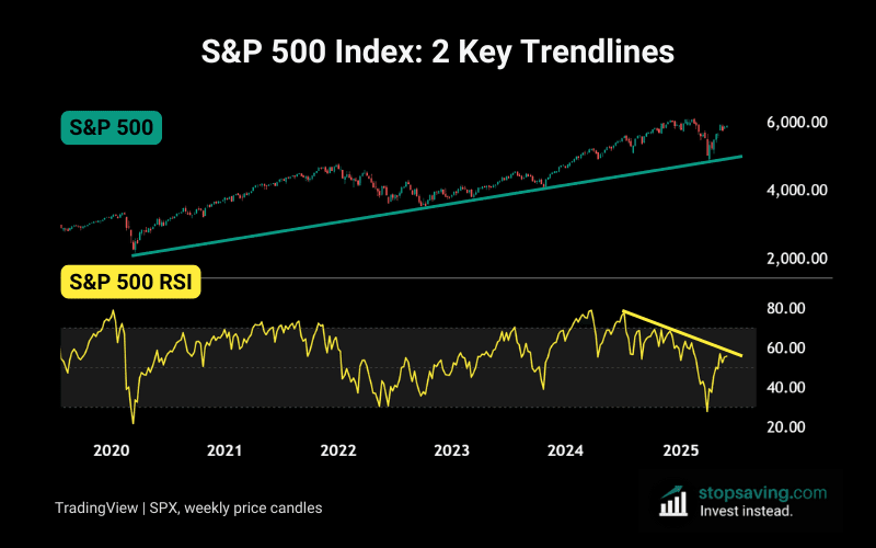
The first chart shows the S&P 500 index itself, with each candle representing one week of movement. I’ve drawn a green trendline that connects the all the lows since the March 2020 Covid crash.
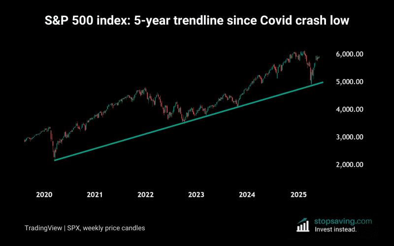
This upward trendline has held as strong price support multiple times over the past five years. So if the S&P were to close a weekly candle below that trendline, it might signal a change in momentum.
But until that actually happens, buying near the trendline still makes sense. That’s because you’d be closer to a reasonable “exit price” if the trendline breaks afterward.
The trendline is currently sitting at about 5,000 points – but that number is rising each week.
Trendline 2: RSI trendline since mid-2024
The next trendline is downward sloping and goes back to July last year. Here, the yellow line connects the highs of the relative strength index (RSI) for the S&P 500. The fact that the RSI is sloping downward shows dropping momentum for the US stock market.
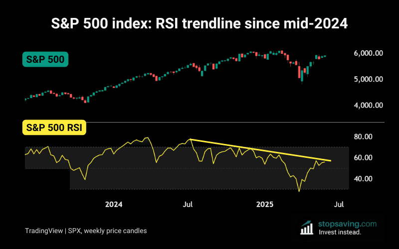
As the chart shows, the RSI is extremely close to that trendline right now. If it breaks it, that would signal a change in behavior – and US stocks might have a better chance of printing new highs this summer.
But if it rejects again, don’t be surprised if the S&P 500 index returns to its green trendline at some point.
The RSI essentially tracks the relative strength of buying pressure vs selling pressure by comparing gains and losses over the past 14 weeks. Download our free PDF guide below if you’d like to learn how to use it in your strategy.
As usual, none of this is investment advice. If you liked this analysis, check out my free newsletter for how-to guides and investment insights across crypto, stocks, metals, and more.