Bitcoin Is Battling To Reclaim Its 50-Day Moving Average

Bitcoin has been battling to reclaim its 50-day moving average (MA, green line) for most of February. If it can’t hold above it, lower price targets await. Below the 50-day MA is the 100-day MA (orange line at about $40,700), then the 200-day MA (red line at about $34,300).
The 50-day moving average is simply the average of bitcoin’s price over the past 50 days. Notice how bitcoin was trading well-above it during the rally that started in October. But with bitcoin’s 20% drop in January, it lost the 50-day MA – before bouncing up off the 100-day MA. Only to now find its current ceiling… back at the 50-day MA.
The 50-day MA has now started to flatten out, too. And if bitcoin doesn’t convincingly trade back above it soon, it’s going to start sloping down – giving more momentum to the sellers. In that case, the 100-day MA would become the next momentum wall for bitcoin buyers to defend.
Bitcoin now vs May 2021: 50-day moving average fractal in progress?
As the old saying goes: history doesn’t repeat, but it often rhymes. The image below compares bitcoin’s current price action with what happened in May of 2021. Notice how bitcoin lost the 50-day MA first, then bounced off the 100-day MA, then lost the 50-day MA again. If bitcoin loses the 50-day MA now, these two charts could start to look eerily similar.
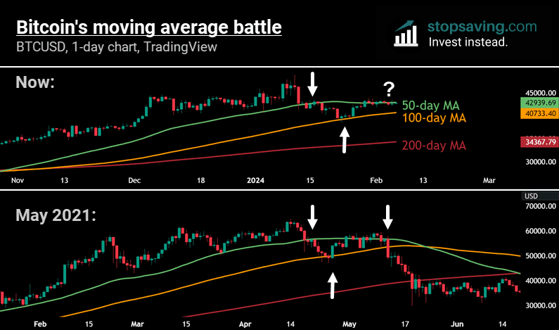
Interestingly, the recent $49,000 top was on the day of the spot bitcoin ETF launch (January 11th). And the $64,000 top in 2021 was on the day Coinbase started trading on the Nasdaq (April 14th). Both of these were massively bullish milestones for the crypto industry. Make of this what you will. Also keep in mind that, after the May 2021 drop, bitcoin made new all time highs about six months later. Make of that what you will.
Want to learn more about moving averages?
Here’s a quick video where I explain what happened to bitcoin and its 50-day moving average in April/May of 2021. I’ve borrowed this from our technical analysis course if you’re looking to learn more!
As usual, none of this is investment advice. It’s just my interpretation of a few imaginary lines on a price chart. But if you want these interpretations as soon as they come out, subscribe to our newsletter below!