XRP Chart Analysis: 3 Things To Watch

XRP has been a top performer this crypto cycle – but it might not be the best time to FOMO in. This chart tracks the weekly price candles of XRP to focus on the longer-term trend (rather than short-term noise). Here are three things to keep in mind.
Contents
Toggle1. Last week’s candle closed red
XRP had four green weekly candles in a row after hitting its mid-June low of around $1.90. That took its price as high as $3.66 by mid-July. But last week, that momentum stalled – with XRP closing its first weekly red candle. What’s more, the XRP price never made a new high last week – last week’s high was $3.65.
The red candle also shows a tug of war between buyers and sellers – with the sellers winning this round. The candle “body” was fairly small – about $3.45 to $3.25 from open to close. But the “wicks” above and below it showed a much wider trading range ($2.96 low to $3.65 high).
So even though the price moved around a lot during the week, it never finished that much lower overall. Still, that indecision does suggest sellers are getting stronger.
2. It opened and closed above the top Bollinger Band
The XRP chart also shows that last week’s red candle opened and closed above the top Bollinger Band. That signals XRP’s recent rally was extreme. Think of it like an elastic band stretching too wide apart. Sure, it can keep stretching, but the risk of it snapping back increases.
It’s rare for assets to open and close an entire week above the top Bollinger Band. And if this week’s candle closes back below the top band, a retest of the middle band becomes more likely (that’s near $2.40 right now).
3. RSI bearish divergence potential
Last but not least, the relative strength index (RSI) has the potential for bearish divergence. If the XRP price closes red this week – and back inside the bottom Bollinger Band – we could call that a swing high. That would be a higher high than both the January 2025 and December 2024 highs. Meanwhile, the RSI in blue would have made a lower high.
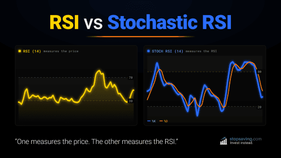
The RSI uses price data over the past 14 weeks to compare buying and selling pressure. When the average gains of “up weeks” get smaller than the average losses of “down weeks”, the RSI goes down.
That would be another sign that buying pressure is waning, and selling pressure is stepping in.
As usual, none of this is investment advice. To get learn more about candles, Bollinger Bands, and the RSI, grab our free PDF guide below:
Key takeaways:
- Last week’s red candle shows rising indecision after XRP had a strong run.
- The price opened and closed above the top Bollinger Band – a rare stretch.
- Weekly RSI bearish divergence may be in the cards for XRP, but it’s not yet confirmed.