


The RSI (relative strength index) is a go-to indicator for many traders and investors. It can help you understand whether buying or selling pressure is strengthening. Here’s a full breakdown of the RSI and how to use it effectively in your strategy.
RSI video guide
Watch the video version of this guide below, where I explain the RSI and how to use it.
PDF download for this RSI guide
You can also download the PDF slide deck version of this guide below. This can be used to summarize the main concepts of the guide.
Who invented the relative strength index (RSI)?
You might wonder who invented the RSI. That would be J. Welles Wilder Jr., an American mechanical engineer and real estate developer. If you’ve ever studied mechanical engineering or know someone who has, you’ll know it involves a lot of mathematical formulas. No doubt, this came in handy when Wilder was building the RSI.
Wilder published a book called New Concepts in Technical Trading Systems in 1978. That’s when he revealed the RSI to the public. He also invented a bunch of other indicators, including the average true range, average directional index, and parabolic SAR. These are all good indicators. But in my trading experience, the RSI is the best of the bunch.

What is the RSI?
The RSI (or relative strength index) is a technical indicator that traders use to gauge an investment’s momentum. It measures the speed and distance of recent price movements to show whether buying or selling pressure is strengthening.
The indicator can also tell you if an investment is overbought or oversold. Overbought means buyers control the trend and oversold means sellers do. The RSI is an “oscillator indicator” with a value between zero and 100. When it’s above 70, it suggests the investment is overbought. And when it’s below 30, it’s oversold.
How is the RSI calculated?
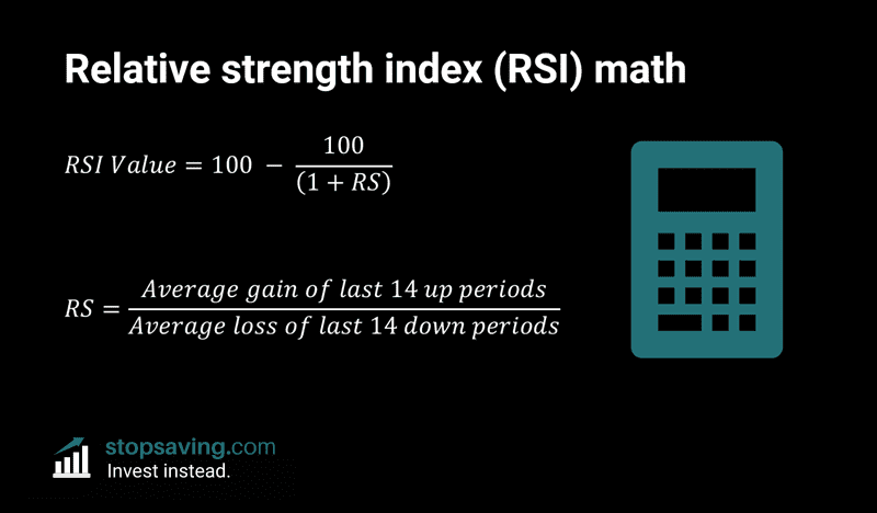
You don’t need to know the above formula to use it in your trading strategy, but it’s useful to understand it. The number 100 is just a mathematical trick to make the index range between 0 and 100. The important bit to understand is the RS value:
RS value = the average gain of the last 14 “up” trading periods divided by the average loss of the last 14 “down” periods.
Say we’re using days as the trading period. Over the past 14 days, there might’ve been five days when the price went up and nine days when it went down. So, the average gain would be the average percentage gain of the five up days. The average loss would be the average percentage loss of the nine down days.
A bigger RS number means the average gains exceed the average losses, and the RSI value is closer to 100 (buying pressure is stronger). A smaller RS number means the opposite: average losses are bigger than average gains over the past 14 trading periods, which puts the RSI value closer to 0 (selling pressure is stronger).
Why an overbought RSI isn’t a sell signal
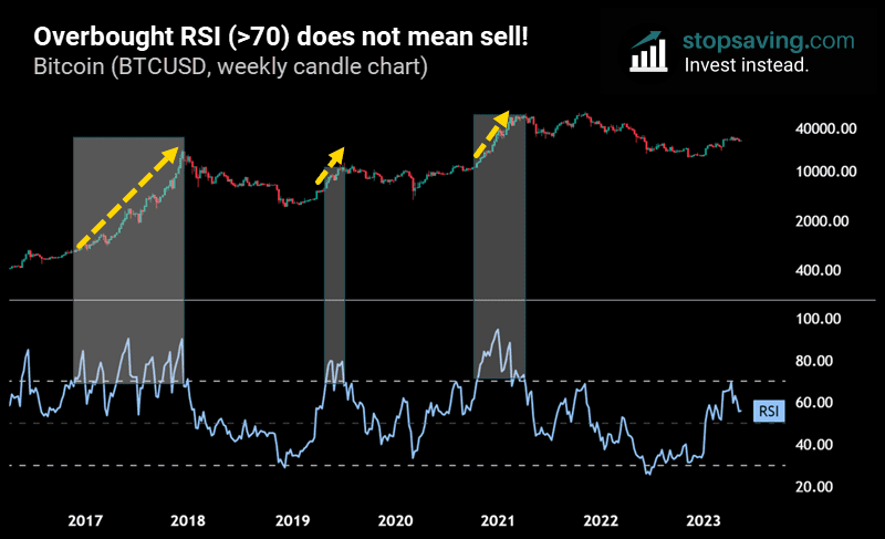
Some investors think you should sell your investment if the RSI is overbought (above 70). But actually, an overbought investment is a sign of buyer strength. And the RSI can stay overbought for a long time before the price eventually comes down. Here’s an example below using the bitcoin price chart and its weekly RSI (blue). As you can see by the shaded rectangles, selling bitcoin when the weekly RSI was above 70 was a bad idea. You’d have missed the most explosive stages of bitcoin’s prior bull markets. So, the RSI getting above 70 is not a sell signal.
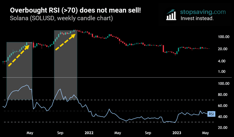
Here’s another example with Solana. Again, the biggest rallies happened when the weekly RSI was above 70.
What about an oversold RSI?
Investments tend to stay overbought for a long time in strong bull markets. But when the weekly RSI is oversold (below 30), it might be a good time to start gradually buying into an investment. That’s assuming you believe in the investment’s long-term fundamentals.
Take the bitcoin chart below. The 2018/19 bear market low happened when the weekly RSI got below 30. But in the 2022 bear market, the indicator dropped below 30 a few months before the ultimate price low. Still, it would’ve been a good time to start dollar-cost averaging into bitcoin.

Another option would be to wait until the RSI made its first higher low after dipping below 30. That was a sign that buying pressure was starting to gain the upper hand. We’ll cover this more next when we explore the topic of RSI bullish divergences.
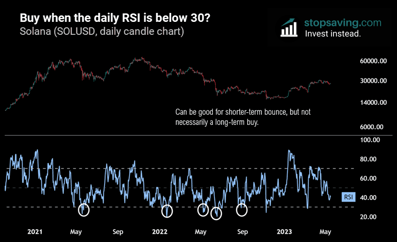
Buying when the weekly RSI is below 30 might be a good long-term strategy sometimes. But buying when the daily RSI is below 30 is far more risky. In the next chart, I’ve circled each time the daily RSI got below 30 for Solana. Sure, some of these would have led to nice short-term bounces in the price. But most of the time, the price kept trending down afterwards.

Regular bullish divergence (buying near the bottom)
Regular bullish divergence can help you decide when to buy an investment in a downtrend—before it turns into an uptrend. You might remember how panicked the stock market was in mid-2022, with talk of high inflation and a recession. Many Wall Street analysts called for much lower prices for Nasdaq based on fundamental economic indicators. Their bearish calls sounded smart, but bullish divergence on the weekly RSI suggested something different: the Nasdaq was close to bottoming.
The chart below shows the bullish divergence for the Nasdaq. On the one hand, the price made lower lows in 2022. That’s technically a bearish sign since the trend was still down. But the blue RSI at the bottom was making higher lows. Even though the price was dropping, the indicator was rising. The average gain of up weeks over the past 14 weeks was greater than the average loss of down weeks. That served as a good indication that buying pressure was getting stronger relative to selling pressure.
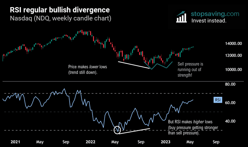
Of course, the Nasdaq didn’t rocket higher straight after that. It took a few months to hang around the lows, forming a double bottom pattern—another sign that sell pressure was starting to wane. Also, note that the weekly RSI got below 30 (circled in white) fairly close to the lows. But it still took a few months before the low actually happened.
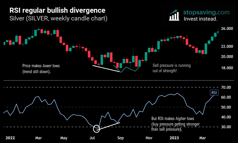
Here’s another example of RSI bullish divergence. This time, for silver, using the weekly candlestick chart. Note the lower lows for the price, with higher lows for the RSI. Again, this “bottom signal” took a while to play out.
Hidden bullish divergence (buying the dip in an uptrend)
Hidden bullish divergence can help you decide whether to “buy the dip” when an investment is in an uptrend. Below is the bitcoin daily candlestick chart, which clearly shows a strong uptrend. But between November 2020 and December 2021, the uptrend slowed down for a half-way stop. At that point, bitcoin was still making higher lows. But investors would’ve asked themselves: “Is now a good time to buy the pullback, or could it be the start of a bigger drop?” That’s where the RSI could have helped.

The RSI made lower lows as selling pressure strengthened. But despite all that selling pressure, the bitcoin price still made higher lows. Sellers were getting stronger, but not strong enough to push the price down. That’s a hidden bullish divergence and a potential sign to buy the dip.
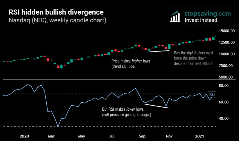
Here’s an example of hidden bullish divergence for the Nasdaq. The price makes higher lows while the RSI makes lower lows—another dip buying opportunity.
Regular bearish divergence (selling near the top)
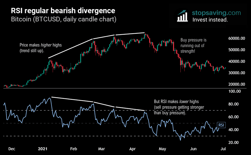
Bearish divergence can help you decide when to sell an investment in a downtrend—before it turns into an uptrend. Here’s the bitcoin daily candlestick chart during the early 2021 top. Notice how the price kept making higher highs until about April. The trend was still up, which is usually bullish. But the RSI in blue was making lower highs. Selling pressure was getting stronger than buying pressure, showing weakness in bitcoin’s uptrend. This bearish divergence took a long time to play out before the eventual crash in May. But after three drives of bearish divergence, the buyers finally ran out of strength.
Let’s zoom out to the one-month time frame for bitcoin. The price has a slightly higher high, then a lower high on the RSI. Also, note how the monthly RSI dropped below the 70 overbought level with the second price top. It showed buyers were losing control of the trend.

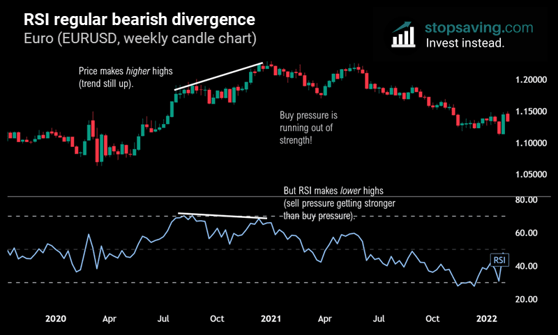
It’s not just crypto markets that can experience bearish divergence. Here’s the weekly candlestick chart of the EURUSD FX trading pair. The price has higher highs, and the RSI has lower highs.
Hidden bearish divergence (selling the rip in a downtrend)
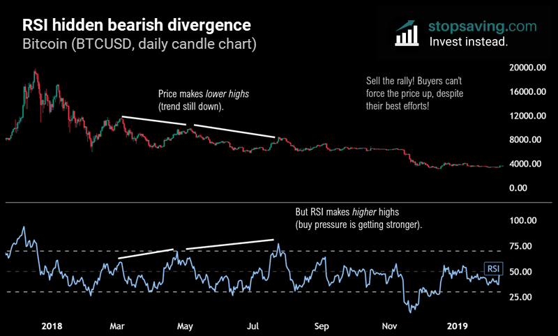
Hidden bearish divergence can help you decide whether to “sell the rip” when an investment is trending down. You can see this with the bitcoin daily candle chart below. The price makes lower highs, so the trend is still down. The RSI, meanwhile, makes higher highs, meaning buying pressure is getting stronger. But despite all that strength, buyers still couldn’t get the price to make a higher high. This hidden bearish divergence would have been a warning sign that the rally would be short-lived.
Divergence cheat sheet: the four kinds of divergence
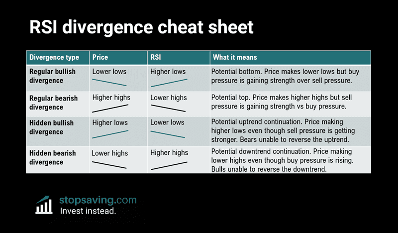
The table below summarizes the four kinds of divergences: regular bullish divergence, hidden bullish divergence, regular bearish divergence, and hidden bearish divergence. We’re using the RSI as the indicator here, but the same principles apply to other momentum indicators like the MACD.
How to confirm local lows and local highs for divergences
Before using any divergence signal in your trading strategy, you must first “confirm” a local low or high for the price. For example, you can’t say bullish divergence is confirmed until the price has made a lower low and the RSI has a higher low. That’s a common mistake that many traders make.
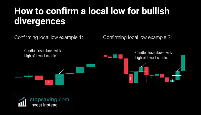
The chart below shows how to confirm a local low for the price. This way, you can act on bullish divergences (regular or hidden). As you can see on the left, the price moved down with a couple of red candles in a row. For a low to be confirmed, you need a candle close above the wick high of the candle with the lowest wick low. You can learn more about candlestick charts here.
Side note: just because you “confirm a low” doesn’t mean the price can’t go lower again. It just means that you are recognizing that a temporary low has been formed. And you can use that low to consider a divergence (if there is one).
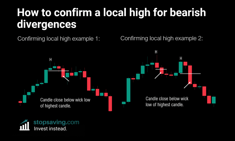
For bearish divergences, you’ll need to confirm a local high with a candle close below the wick low of the topping candle. The two examples in the chart below show this.
RSI trendlines
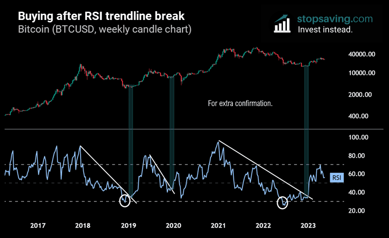
Many traders draw trendlines on a price chart to track an investment’s momentum. But you can also draw trendlines on the RSI itself in your analysis. In early 2019, bitcoin’s weekly RSI broke the downward trendline shown below. As you can see, this would have been a great time to buy bitcoin. The second example in 2020 would have made for a good long (buy) trade, even though the price dropped much more after that. Finally, buying the RSI trendline break would have gotten you bitcoin for less than $20,000 per coin at the bottom of the 2022 bear market.
Enjoyed this RSI guide? Sign up for our free newsletter for how-to-guides and investment ideas across crypto, stocks, metals, and more.
This guide is part of our 100% free trading and technical analysis course.
Key takeaways
- The RSI measures the speed and distance of price movements.
- It ranges between 0 and 100 and shows the relative strength of buy pressure vs sell pressure (based on average gains over average losses).
- The RSI can stay overbought (>70) or oversold (<30) for a long time, so it’s not always a good buy or sell signal!
- A weekly RSI below 30 can be a good long-term buy signal if the asset has good fundamentals.
- Look for RSI trendline breaks and/or divergences between the RSI and the price for best results. Track candle closes to confirm divergences and trendline breaks.