

Candlestick charts are an essential part of trading and technical analysis. In this guide, you’ll learn how to read, interpret, and use candlestick charts in your trading or investment strategy. You’ll also learn why candlestick charts are more useful than simple “line charts”.
Video version of this guide
PDF download for this guide
You can also download the PDF slide deck version of this guide below. This can be used to summarize the main concepts of the guide.
Line charts vs candlestick charts
Line charts are simpler than candlestick charts but don’t give you as much information about the price. A line chart connects the prices of an investment from the end of each trading period. For example, here’s a 1-day line chart for bitcoin below. Because it’s a 1-day chart, it connects bitcoin’s end-of-day prices (without showing what happens to the price during each trading day).
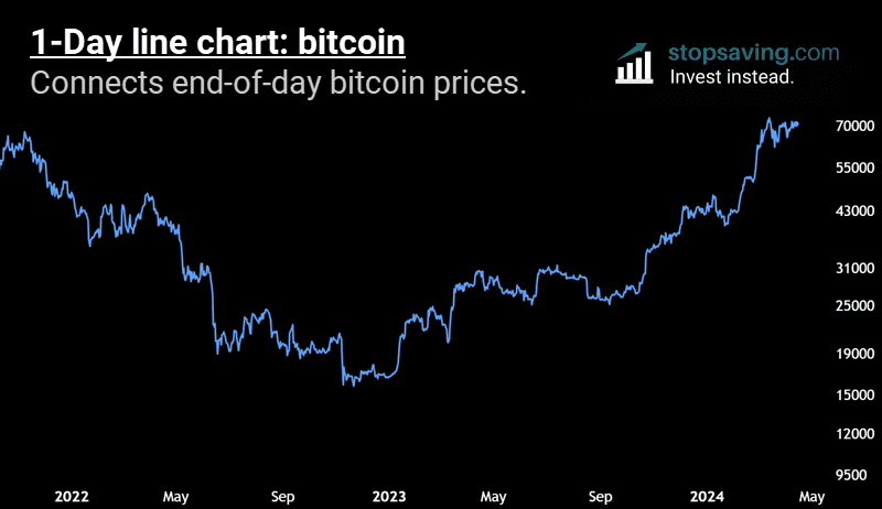
Side note: unlike the stock market, the crypto market never closes. So for bitcoin and other cryptos, the last price of the trading day is taken at midnight UTC (Universal Time Coordinated). That’s 1 AM London time in the UK summer and midnight London time in the UK winter.
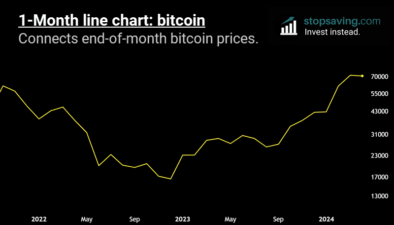
You can have a line chart for any trading time frame: hours, days, weeks, or months. Below is a 1-month line chart for bitcoin. Notice how the line is a lot smoother than the 1-day chart above. That’s because it connects end-of-month prices (and ignores all the intra-month price movement).
What are candlestick charts?
Line charts can be useful, but if you’re looking to up your trading game, you should use candlestick charts. Candlestick charts give you more information about price action than line charts.
A Japanese rice trader named Munehisa Honma invented candlestick charts in the 1800s. The infographic below explains how price candles work today.
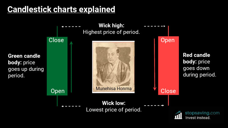
Green candles: A green candle body means the price rises during the trading period. In the above example, we’ll assume the trading period is a day, but it can be any time frame from minutes to months. The bottom of a green candle body represents the opening price – or the price the investment started trading for when the market opened that day. The top of the candle represents the closing price – or the last price the asset traded for on the day.
Red candles: A red candle body means the price drops during the trading day. Here, the opening price is at the top of the candle. Then the price goes down and closes at the bottom of the candle body.
Price candles also have wicks on either side, which show the highest and lowest prices reached during the trading day. The top wick shows the intra-day high and the bottom wick shows the intra-day low. So, the candle body only measures the difference between the opening and closing prices. It doesn’t include any price movements outside that range during the day.
Price candle body-to-wick ratio
The size of the candle body relative to the candle wicks can tell you a lot about the power of a trend.

Big candlestick body-to-wick ratio: A bigger candle body relative to the wicks shows that more price action occurred between the open and close. Generally, it means the market is making a clearer decision on the direction of the trend (be that up or down). That’s because the candle body shows most of the important price action, and cuts out the extreme highs and lows of the trading day.
Small candlestick body-to-wick ratio: A smaller candle body with larger wicks on either side can mean the opposite: indecision among investors over the trend direction. Here, the price moves around a lot during the trading period but closes near the open. So, neither buyers or sellers have control at the end of the trading period.
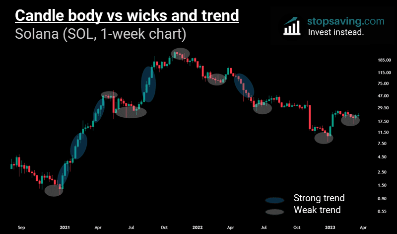
The below chart of Solana (SOL) shows this concept in reality. Notice the candles in the blue ovals generally have bigger candle body-to-wick ratios, and those happened when SOL was in a strong trend (up or down). Compare that with the gray ovals, where there was investor indecision about whether the price would go up or down. Here, the body-to-wick ratio was smaller, showing a weaker trend (or a more sideways market).
Bullish trend continuation candlesticks
Bullish trend continuation candles: These are full-bodied green candles. You typically see them in a strong uptrend. A bullish full-bodied candle suggests that the price closed closer to the highest price of the trading period. In other words, the bulls finished up strong.
Here are three examples of bullish trend continuation candles:
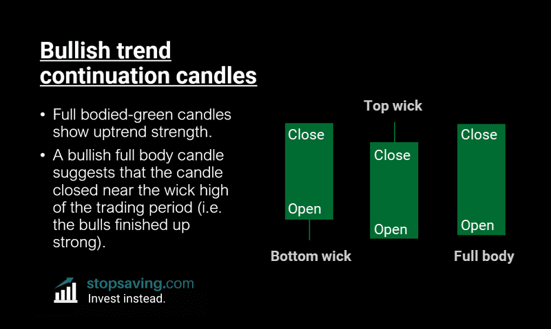
Bottom wick green candle: The price went lower than it opened during the trading day (or whatever candle time frame), but it closed near the highs. A strong finish from the buyers.
Top wick green candle: The price never quite closed at the highs. Still, it closed a lot higher than its open price. Another strong finish from the buyers.
Full-bodied green candle: No wicks at all. These are rare and can be quite bullish if you see them. They show that the price never traded below the opening price, and still finished at its highest possible price.
Bearish trend continuation candlesticks
We can explain bearish continuation candles in the same way as bullish ones, but in reverse.
Bearish continuation candles: The price closes closer to the wick low of the candle, meaning the sellers are in charge at the end of the trading period.
Here are three examples of bearish continuation candles in action:
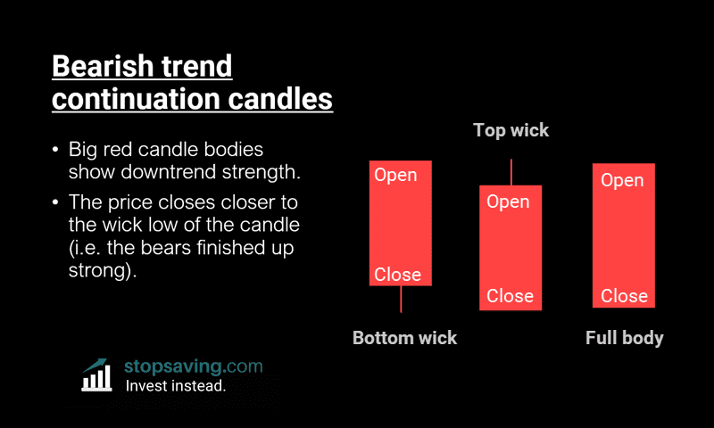
Bottom wick red candle: The price closed close to the low of the trading period. A strong finish from the sellers.
Top wick red candle: The price went higher during the trading period, but still finished up in the red.
Full-bodied red candle: No wicks on either side. These show that the price never traded above its opening price, and finished near its lowest possible price. That can be a sign of more downside to come.
Bullish reversal candlestick examples: Hammer, Inverted Hammer & Indecision Doji
Downtrends often end with some sort of bullish reversal candlestick. Here are a few examples.
Bullish Hammer candlestick: The price wicks very low during the trading period. But then the dip gets aggressively bought up by buyers – and the price finishes the trading period higher than it started. You can see two Bullish Hammers in action for gold below.

Inverted Hammer candlestick: This time, the price goes much higher during the trading period, with a high wick at the top of the candlestick. But even though sellers stepped in, they still couldn’t get the price to close the trading period in the red. You can see an example of an inverted hammer candle near the lows of the US dollar index (DXY).
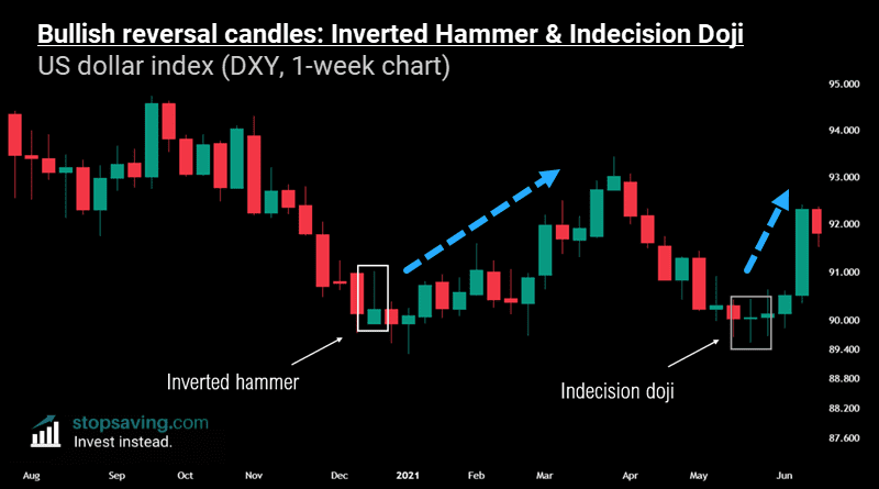
Bullish Indecision Doji candlestick: Also, notice the indecision doji candle after that (above). That’s when the price moved up and down a lot during the trading period, but neither buyers or sellers finished in control. So in this example, it suggests that both sellers and buyers are getting less confident in the current direction of the trend – which can sometimes be a sign of a potential trend change.

Bearish reversal candlestick examples: Shooting Star, Hanging Man & Bearish Indecision Doji
A bearish reversal candle can be a sign that an uptrend could be about to turn into a downtrend.
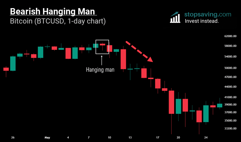
Bearish Hanging Man candlestick: The price drops lower during the period, but then buyers buy the dip. Despite that, the sellers still finish in control as the candlestick closes in the red.
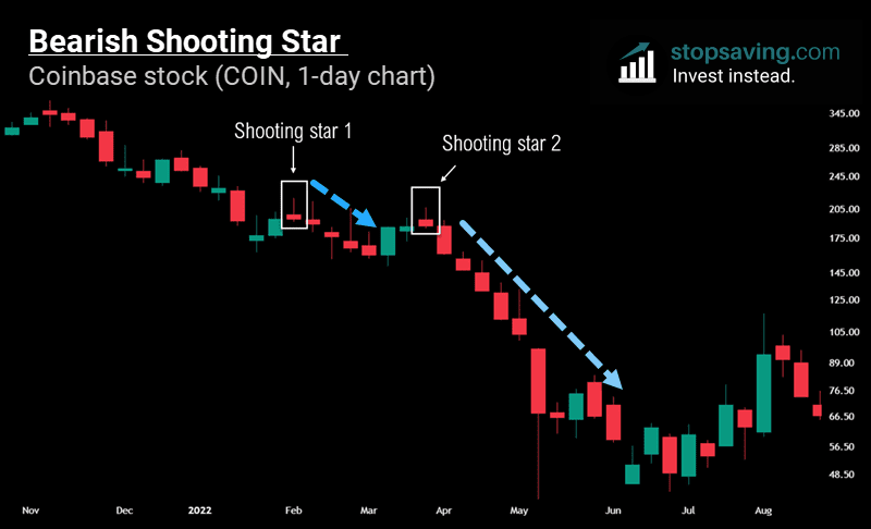
Bearish Shooting Star candlestick: You’ll often see these in “blow-off tops”. The price shoots higher during the trading period while investors are euphoric, but then gives back the whole rally by the end of it. Below are two bearish shooting stars for Coinbase stock (COIN).
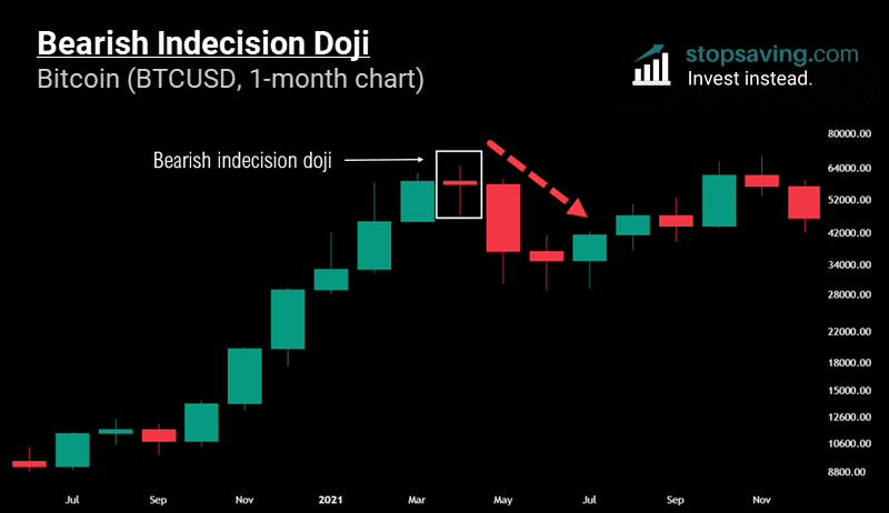
Bearish Indecision Doji candlestick: These show indecision among investors after a big price rally, and can be an early warning sign that buyers are getting less confident.
Candlestick chart patterns (with two candles in a row)
When it comes to trading, two candles are better than one. So let’s now look at a few common types of candle sequences that can signal a change of direction in the price.
Bullish engulfing candle sequence: First, there’s a red candle at the bottom of the downtrend – a showing of strength from the sellers. Second, comes the green “engulfing” candle. During the trading period, the price gets lower than the wick low of the prior red candle. But then buyers step in with strength, and the candle closes above the high of the previous red candle. In other words, the price went up over the trading period overall, and power has shifted from sellers to buyers.
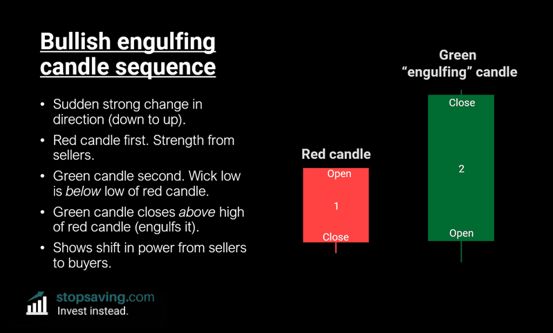
Here’s an example of a bullish engulfing candlestick sequence for bitcoin on the 1-week chart. Notice how the price looked like it was about to fall over after the first red candle in the sequence, but things looked very different after the green engulfing candle. This was a potential sign that buyers were about to take control.

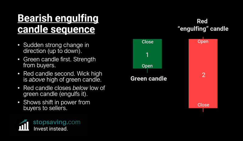
Bearish engulfing candlestick sequence: This is the opposite of a bullish engulfing sequence, with a sudden change in direction from up to down in the price. And this time, it shifts the power from buyers to sellers. First, you have a green candle, then an engulfing red candle – which puts the sellers back in control. The high of this red candle is initially higher than the high of the green candle. But then, sellers push the price down so it closes below the low of the green candle.
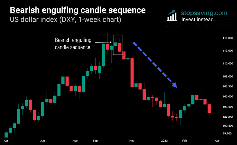
The chart below shows a bearish engulfing candlestick sequence for the US dollar index (or DXY) on the one-week chart. Notice how the high of the red candle is pretty much exactly the same as the high of the green candle. But even though it technically never went higher, it’s still clear that sellers took control at the end of the week, with the index closing in the red – below the low of the week before.
Candlestick chart patterns (with three candles in a row)
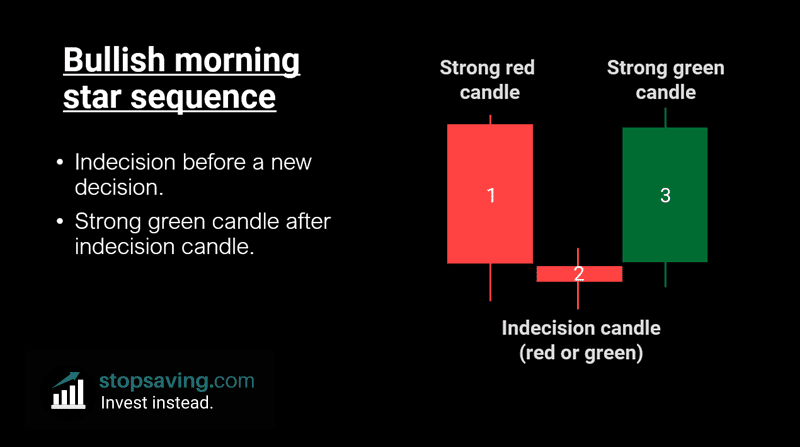
Bullish morning star candlestick pattern: This is where there’s indecision among buyers and sellers, which is then followed by a new decision in favor of the buyers. In other words, you get a strong green candle after an indecision candle. Note that the indecision candle in the middle can be red or green – as long as it has a small body relative to the wicks.
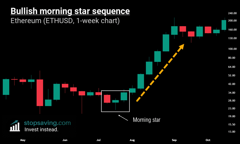
You can see a bullish morning star sequence in action with Ethereum in the chart below.
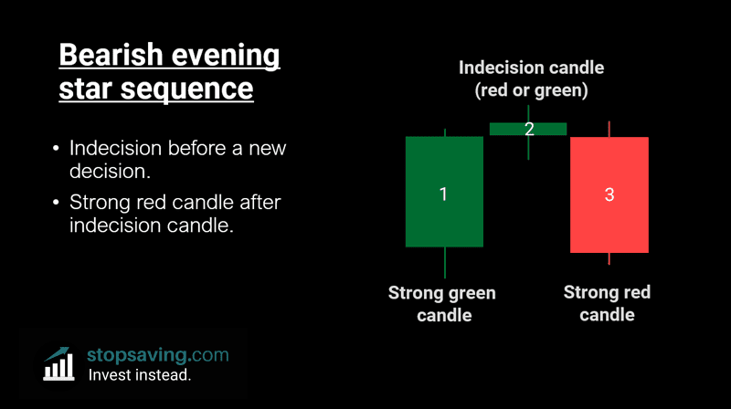
Bearish evening star candlestick chart sequence: Like the morning star above, this represents investor indecision before a new decision. And that comes in the form of a strong red candle after an indecision candle. So this time, the sellers take control.
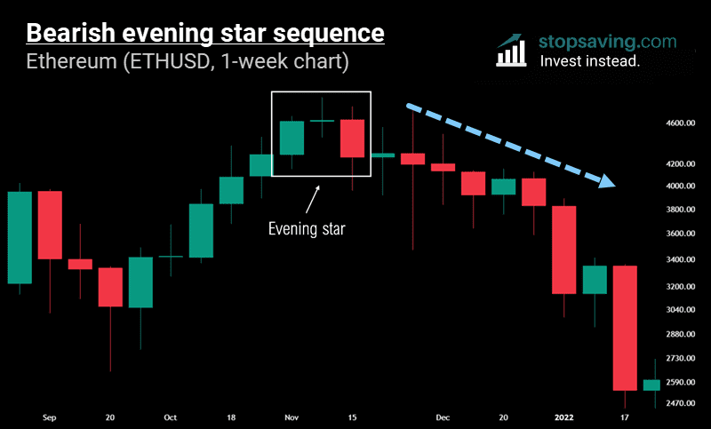
And finally, here’s an evening star for Ethereum in the chart below. This one shows renewed strength from sellers and a big price drop afterwards.
Enjoyed this guide? Sign up for our free newsletter for more of them. And get my free welcome eBook about trading when you do.
This guide is part of our 100% free trading and technical analysis course. Check out the next guide on how to choose the best trading time frame for your strategy!
Key takeaways
- A line chart is made up of closing prices only. For example, a daily line chart connects the closing prices of each trading day.
- Candlestick charts consider movement within each trading period. So, they give you more information than line charts.
- There are many different types of candlesticks, but there’s no point in memorizing all the different names. Instead, think about what price candles say in terms of buyer vs seller strength. Focus on how candles close vs the wicks.