


This guide covers the essentials of technical analysis. We’ll also look into five examples to show what technical analysis can do. Whether you’re a short-term trader or a long-term investor, understanding technical analysis can boost your bottom line. And it can work with crypto or traditional investments like stocks, gold, and commodities.
Video version of this guide
PDF download for this technical analysis guide
You can also download the PDF slide deck version of this guide below. This can be used to summarize the main concepts of the guide.
Why learn technical analysis?
Legendary American investor Bernard Baruch said it best: “Show me the chart and I will tell you the news”. See, a price chart contains more information about the state of investor sentiment than any news article ever could. But to truly get a grasp of what price charts are saying, we must first know how to read them. That’s where technical analysis comes in – aka “the language of price charts”.
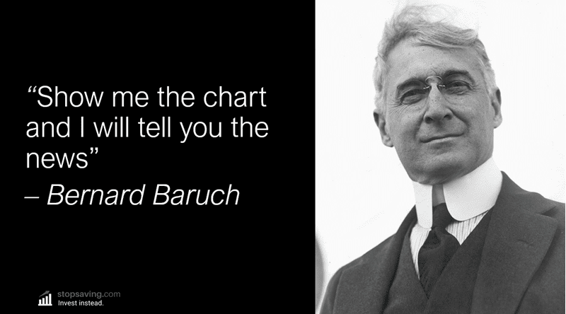
Baruch made millions in the 1920s bull market and then shorted stocks before the 1929 crash. So as you can imagine, he did pretty well for himself. He used simple price lines to chart daily price moves of different stocks. Today, we have way more tools at our disposal. One of those tools is TradingView, which I’ll use later when we dig into a few technical analysis examples.
Technical analysis operates on the principle that all news and information about an investment is reflected in its price chart. And let’s face it, it’s much easier to read a price chart than to sift through all the news!
Technical analysis explained in one sentence
Let’s now come up with a simple definition of technical analysis, or “TA”. Here’s the classical definition by Investopedia:
“Technical Analysis is a trading discipline employed to evaluate investments and identify trading opportunities by analyzing statistical trends gathered from trading activity, such as price movement and volume.”
This is a good definition and it effectively explains what TA is and what it’s used for. But here’s a simpler definition:
“To analyze an investment’s price chart, to make an educated guess where the price might go next.”
I’ve emphasized the word “guess” here, because nobody can predict exactly what prices will do next. But by using technical analysis, you’re at least making an educated guess, rather than flipping a coin.
What do technical analysts do?
At any point in time, a technical analyst should be asking themselves two “simple” questions:
- Is the price more likely to change direction or keep going in the same direction?
- Is the price move slowing down or speeding up? I.e. is the trend getting weaker or stronger?
Technical analysis can give you the framework to answer these questions. It can help you identify trends, determine entry and exit points, and manage your risk. It can also help you understand market psychology and the forces that drive price movements. The price of an investment at any point in time is simply the result of buyer versus seller pressure. And by thinking in terms of buy and sell pressure, technical analysis will start to make a lot of sense.
How does buy and sell pressure affect the price of an investment?
More buy pressure: Buyer demand is greater than seller supply. The price goes up as buyers are willing to pay more to outbid other buyers.
Equal buy and sell pressure: Buyer demand and seller supply are in equilibrium. And the price stays flat or stable.
More sell pressure: Seller supply is greater than buyer demand. This causes the price to go down, as sellers compete with each other to offload their investments in a hurry.
Now that you know what technical analysis is in theory, it’s time to see what it can do in reality. So, let’s look at five examples where technical analysis could have helped you time market tops and bottoms.
Technical analysis example #1: Bitcoin top of April / May 2021
Here’s a bitcoin price chart from TradingView. It’s a 1-day chart, meaning each red or green “candle” represents one day of price movement. From late 2020 until early 2021, bitcoin went from about $10,000 a coin to about $60,000. The blue line is the 50-day simple moving average (SMA). Notice how it sloped upwards and supported bitcoin’s price during the rally, with buyers stepping each time it tested the 50-day moving average. This moving average is simply the average of bitcoin’s price over the most recent 50 days. When bitcoin was trading above it, and the line had an upward slope, buyers were in control of the trend.

But something changed in April 2021 (point 1). Bitcoin finished the trading day below the 50-day SMA. This was an early warning sign of a change in investor behavior. Buyer demand was now weak at the 50-day SMA, and the price dropped quite far below it.
Then came the next sign of buyer demand getting weaker, and seller supply getting stronger (point 2). Bitcoin made its first lower low of the bull run that was also below the 50-day SMA. An uptrend is made up of higher highs and higher lows. And now that there was a lower low in place, the uptrend looked like it could potentially turn into a downtrend.
For a true downtrend, you also need the price to make a lower high. And that’s exactly what happened in May. It also dipped back below the 50-day SMA again (point 3). The slope of the SMA started to flatten out, too. These three warning signs would have been enough for a focused technical analyst to get cautious about holding bitcoin.

Technical analysis example #2: S&P 500 bottom of late 2022
Next, we’ve charted the S&P 500 (ticker SPX) and its turnaround in late 2022. We’re using the 1-week chart, so each red or green candle represents one week of price movement. As you can see, the market topped at the start of 2022. The price then trended down until the low in October of that year.
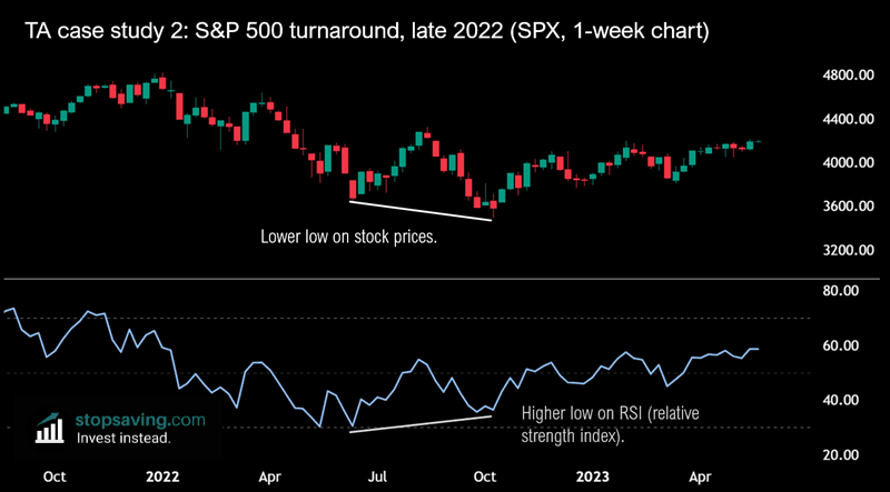
Notice how the price made a lower low in October than it did in June. Lower lows are typically bearish, and show that sellers are still in control of the market as they’re able to push the price down to lower levels.
But on the bottom, you’ll notice the relative strength index (RSI, blue line). The RSI essentially measures the relative strength of buy pressure vs sell pressure. And as you can see here, the RSI made a higher low as the SPX made a lower low. This meant that even though the price was trending down, buying pressure was getting stronger relative to selling pressure. Put another way, the downtrend was running out of fuel. We call this a bullish divergence.
Now, you might recall that most news articles were bearish about the economy and inflation at this time. Many fundamental analysts were calling for a big recession and much lower prices on the S&P as a result. But looking at this simple chart using technical analysis, you would’ve had a good reason to not buy into that bearish sentiment – and potentially buy into the S&P 500 instead.
Technical analysis example #3: Why the pound never reached “parity” with the dollar in late 2022
If you were living in the UK in 2022, you would’ve been worried about the value of the pound. It was going down rapidly. There was a lot of bearish sentiment, with economists, analysts, and news commentators all calling for the pound to reach parity with the dollar (where one pound would be worth one dollar). But if you were a technical analyst looking at this price chart, you would’ve been more inclined to buy the pound near the lows.
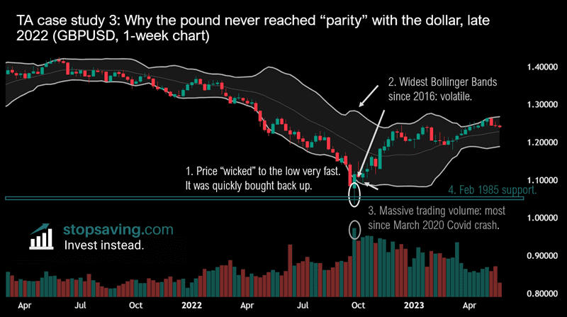
Point 1: The pound reached its low of $1.036 to the pound with a “capitulation wick”. The stick at the bottom end of the candle (white circle) shows that the price dropped by a lot during the week. But by the end of the week, the body of the candle closed in the green – higher than it did the week before. This was a potential price reversal candle.
Point 2: The candle closed back inside the Bollinger Bands – or above the bottom band. Bollinger bands are extremely useful indicators as they measure an investment’s volatility. The wider the bands, the more volatile the investment is at the time. And at the time of that reversal candle, the Bollinger bands were the widest they’d been since 2016.
Point 3: There was massive trading volume on this volatile candle. It was the most volume traded since the March 2020 Covid crash. This meant that lots of buyers were willing to buy the pound at these lower levels.
Point 4: The price briefly pierced below the February 1985 low of $1.05 to the pound, but didn’t break it.
To put this in a language that doesn’t involve technical analysis: there was peak panic and bearish sentiment, as investors threw in the towel at the worst possible time. Big traders then bought that panic and quickly reversed the price. This was “capitulation” and something you tend to see when prices make fast lows before quickly reversing in the other direction.
At this time, Liz Truss was the UK prime minister and the market wasn’t fond of her economic policies. Rishi Sunak then took over as prime minister on October 25th. Investors saw him as a safe pair of hands for the UK economy, and the pound then rallied. But notice that the capitulation happened a few weeks before Sunak became prime minister. This is a great example of how the price leads the news. As Berard Baruch would say: “show me the chart and I will tell you the news.”
Technical analysis example #4: Brent Crude Oil double top in 2022
In late 2021 / early 2022, traders were speculating that the global oil supply shortage would cause prices to go much higher. Here’s how it all panned out in the chart.

Point 1: A “blow-off top”. The price reached $138 a barrel with extreme trader euphoria and volatility. Note how the Bollinger Bands were very wide here – similar to the earlier example with the pound, but this time in reverse. Instead of the price spiking lower very quickly, it spiked higher. Notice how the price wicked far above the top Bollinger Band, signaling an extreme move (that was also unsustainable).
Point 2: The oil price drops. Investors buy the dip, thinking the price will keep going up. It did go up, but slower than the first time.
Point 3: A second top. This time, the price only reached $124 – investor greed and euphoria were replaced by complacency. There was way less volatility, given the Bollinger Bands were much narrower. And the price never broke above the top Bollinger band – another sign that the second top was less powerful. The price never made a higher high because buying pressure got exhausted and selling pressure took over.
At the second top, Goldman Sachs predicted $140 oil prices. Their fundamental analysts were looking at macro factors – things like geopolitics and industry demand for barrels of oil versus supply. But if they had let one of their technical analysts look at this price chart, they probably wouldn’t have made that call.
Technical analysis example #5: Gold bear trap of late 2022
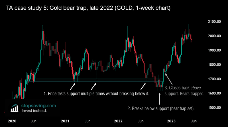
Point 1: Gold was in a sideways trading range for two years from late 2020 until late 2022. Notice how gold tested the rectangle as price support multiple times without breaking below it.
Point 2: The price broke below support after the summer of 2022, which turned many traders bearish. They began to short gold, thinking the price would go down much further. And investors who owned gold might have sold their position, thinking they would get a better opportunity to buy back in at a lower price later on. This essentially laid the bear trap. Everyone who was bearish on gold, had a good reason to be bearish.
Point 3: A bullish deviation. After briefly going below support, the price closed back above support. In other words, the bears were now trapped in losing short positions. When you short an investment, the only way to exit that trade is to buy back the investment. So as the price of gold started going back up, shorters had to buy gold to exit their positions for a loss. This set off a cascade of forced buying, which drove the price higher fast. It was a classic “short squeeze”.
We haven’t used any indicators at all with this example. But by understanding how the price interacted with price support, we’d have enough information to make an informed trading decision.
Enjoyed this guide? Sign up for our free newsletter for more of them. And get my free welcome eBook about trading when you do.
This guide is part of our 100% free trading and technical analysis course. Check out the next guide on the Wyckoff Method here!
Key takeaways
- All available information (that the market knows about an investment) is baked into its price chart.
- You can use technical analysis to study an investment’s price chart, to make an educated guess where the price might go next.
- Technical analysis can help you determine the strength of a trend. Is the trend getting stronger or weaker?
- You can use technical analysis on any investment – so long as it has a price chart!
- Technical analysis is good for short-term traders and long-term investors.